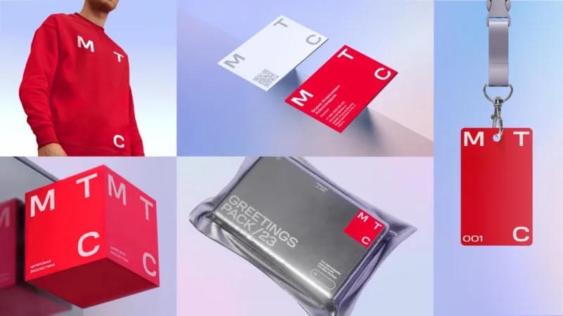
MTS refused the egg in the logo
MTS, one of the largest mobile operators in Russia and the CIS countries, has conducted a global rebranding. The company has introduced a new logo reflecting a new strategy and positioning in the market.
There will no longer be an image of an egg on the new logo. It was replaced by a red square with the letters "M", "T" and "C" around the perimeter. Two agencies worked on the new brand concept - UtterDesign and Ony.
According to the president of the company Vyacheslav Nikolaev, after updating the brand in 2019, it became clear that "this was not enough", so a full-fledged rebranding was required. The cost of the work was 20-30 million rubles.
The updated logo reflects the company's new strategy, which is focused on providing digital services. As representatives of the company noted at the presentation on the occasion of the rebranding, MTS has grown from a mobile operator into a digital ecosystem in recent years.
ORIENT news