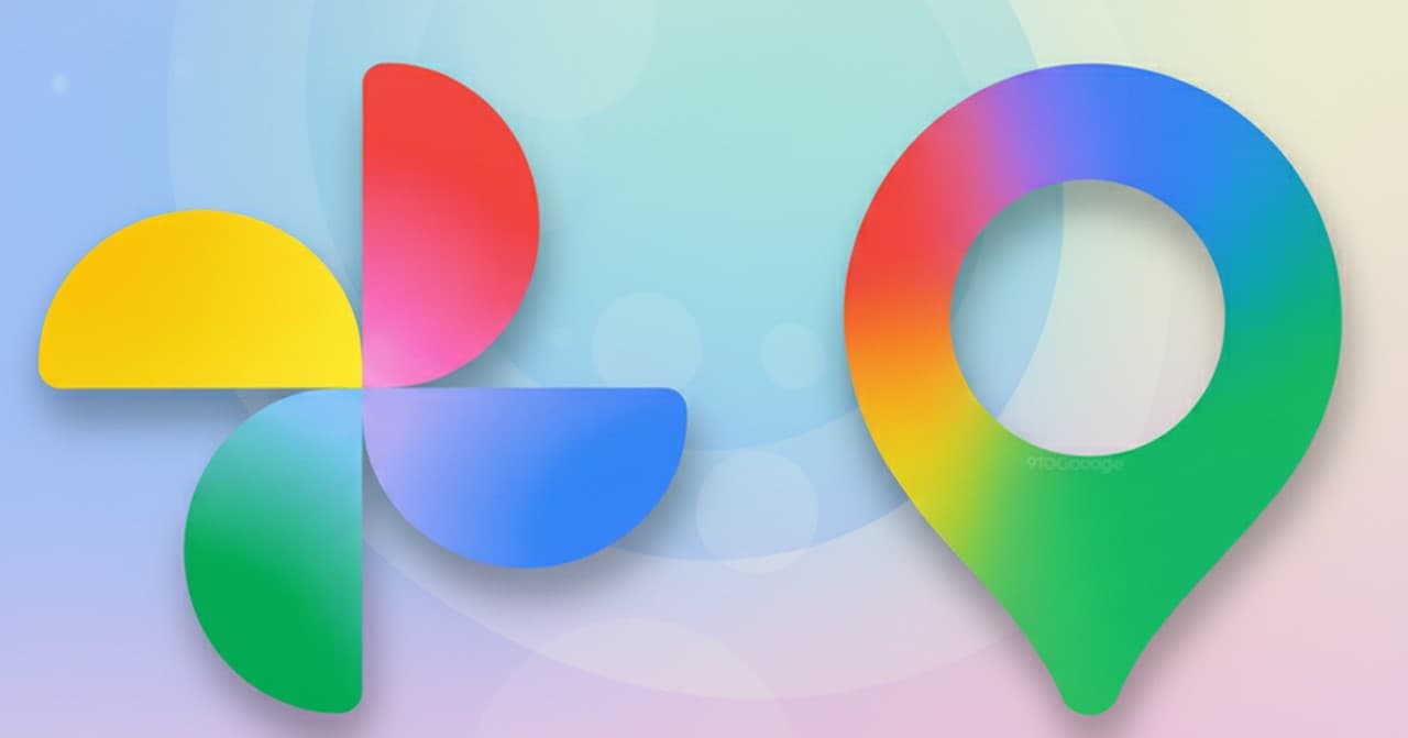
Google continues a large-scale redesign of its visual identity to highlight the integration of its Gemini artificial intelligence (AI). After updating the main Google logo and the Gemini symbol, the company is preparing to introduce new gradient icons for the popular services Google Photos and Google Maps.
The new branding is still based on Google’s classic four colors (red, yellow, green, blue) but now uses gradient transitions. According to the company, the brighter shades and smooth gradients symbolize “a burst of innovation and creative energy driven by AI.”
Images of the new icons have already appeared online:
Google Maps: The icon keeps its recognizable map pin shape, but now looks slimmer, with the inner circle enlarged. This is likely connected to Gemini helping users create lists of places and travel routes.
Google Photos: 3The icon maintains its shape but adopts a full gradient that spreads outward from the center. When small, the icon appears rich and saturated; when larger, the center becomes more translucent.
Google is expected to roll out the new icons across apps and web services soon, completing the brand’s visual unification.
ORIENT
